Well so much for reporting the day by day, instead it has fallen to the weekly interval. But, much was accomplished this week in spite of missing my hubby helper who has been an uber-busy business traveler.
Almost done, minus my office area (hence the ladder peeking through the curtains). The student stations are all done sans some wall embellishments like inspiring pictures of works in progress, or encouraging words. We got the anti-vibration rubber installed under all the cabinets so that the sound of hammering is transformed from a bang, bang, bang, to a tink, tink, tink. This will hopefully keep me endeared to my neighboring artists across the hall and on the first floor.
Much sawing and assemblage, nailing and painting... design and selection of things that will maximize the wee 8 foot width of this space. The thought put into the preliminary design has paid off ten fold as the room now actually feels much larger that it did originally. Contrary to popular belief, darker colors can actually expand the perception of a room.
Fortunately for this artist, there is a place called IKEA, and even more fortunate for some reason they have been over-stocking their AS-IS room. My visit there on an almost daily basis has paid off big time, from the discovery of a perfect workbench to nice wooden drawer pulls for 25cents a pair. Three places where I really splurged was the gallery flooring, the two beautiful glass cases, and the student seating. But at 250.00 for both, those glass cases bring the gallery to life, and they are lockable. And I have to admit being a little obsessive about the stools. I literally butt-tested a dozen different styles before selecting these (again, thank you Ikea) which came in a pack of two and are the most comfortable stool I have ever sat on.
Hey who can be creative with a sore butt?
And they add a wonderful zen sort of style to the space and fit perfectly in the little niches.
Yea... I am really obsessive about the student experience. But I have always been highly sensitive to how a space can help or hinder the creative process. The muse needs a happy and inspiring place to live, and that includes a lot of things...
functionality,
comfort,
beauty.
All of these things feed the muse, and my hope is in this new creative space that I can help other would-be artists to be inspired.
There is still much left to do in the next few weeks. Preparing for the classes that start Dec 2nd and are posted here and all the finishing touches and tests (like a torch test to make sure my flames don't set off the park's fire alarms;-) It is a wild ride, but already the studio feels like home with my tools and supplies mostly moved in.
My official grand opening will coincide the reception for the park's holiday show on Dec 12th from 7-9. So if you are in the area please stop by for a glass of wine and a peek at my new creative home.
view of gallery into office
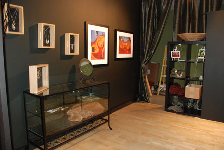
view from gallery into workshop
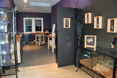
student stations and very comfy stools
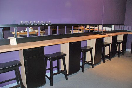
25 cent drawer pulls
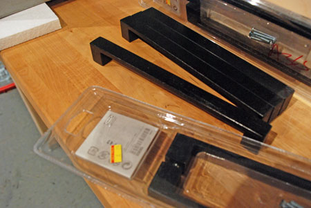
before shot



Maybe the torch test should have come BEFORE the decor? What it is turns the sprinklers on?? Holding thumbs for ya!
ha... yea, the cart before the horse. But if it sets off the alarms they will adjust the smoke detector accordingly.;-)
Looks fantastic and like lots of fun to come. Those are the stools I was talking about. I know when people see the place they will want to take a class.
Absolutely beautiful, Blair! Good job!